Archive

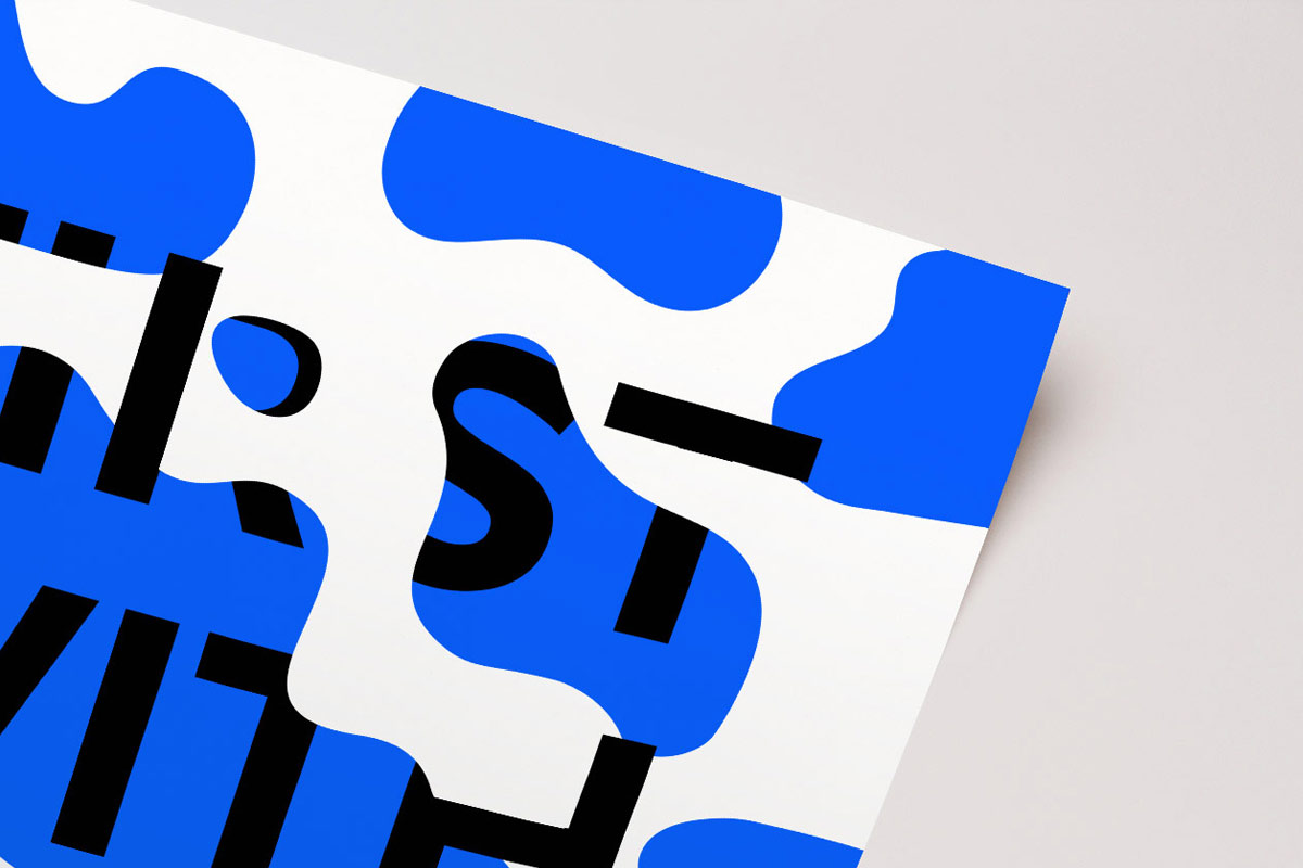
[vc_row content_text_aligment="" use_row_as_full_screen_section="no"][vc_column][vc_column_text] First take five [/vc_column_text][/vc_column][/vc_row][vc_row content_text_aligment="" use_row_as_full_screen_section="no"][vc_column][vc_column_text]This is a personal project, with which I wanted to play around with typography. I wanted to see how much I could cover up and obfuscate the letters without losing the intended meaning of the words. A milky white

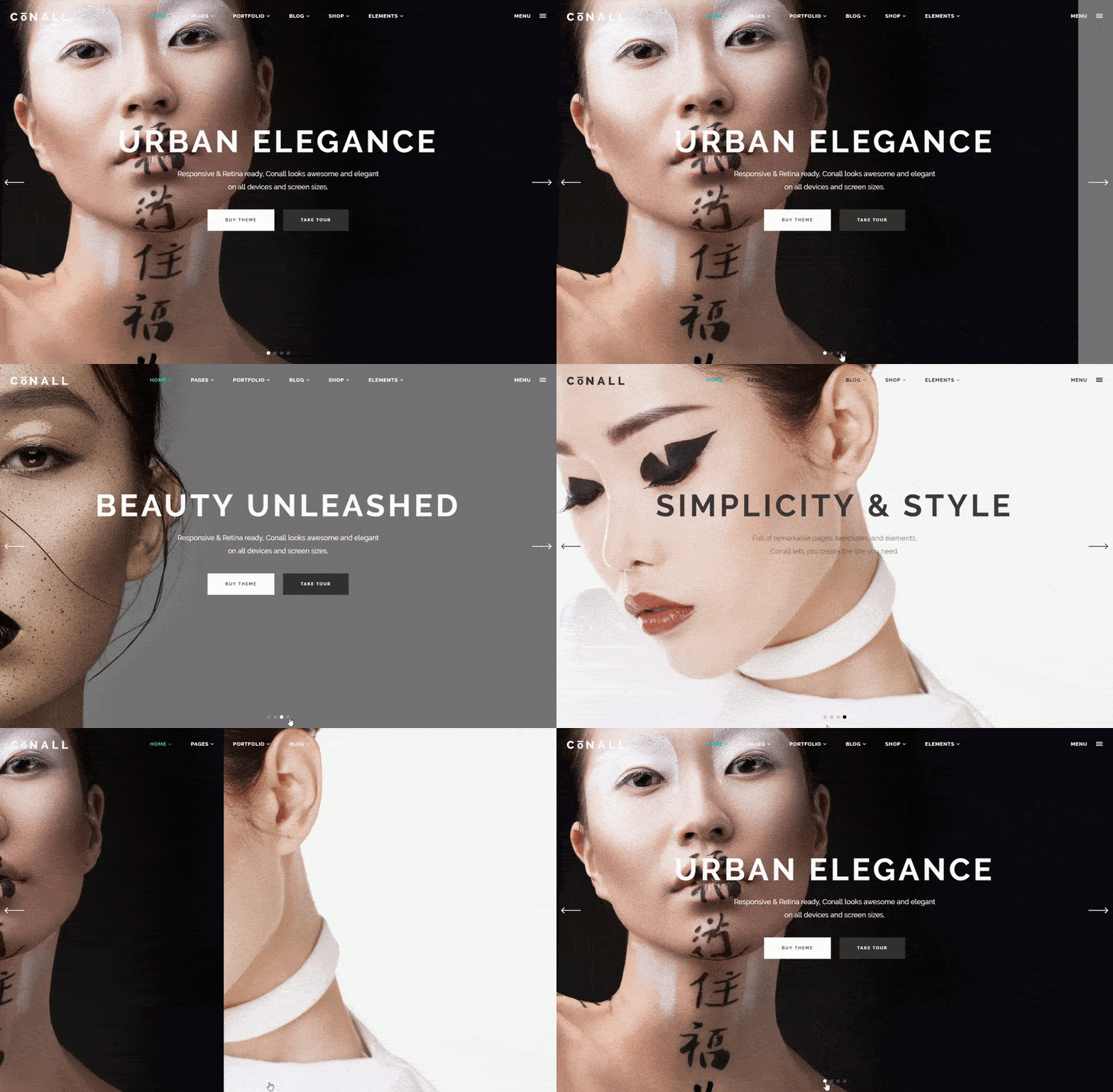
[vc_row content_text_aligment="" use_row_as_full_screen_section="no"][vc_column][vc_column_text] Conall Theme [/vc_column_text][/vc_column][/vc_row][vc_row content_text_aligment="" use_row_as_full_screen_section="no"][vc_column][vc_column_text]The idea behind Conall was to make a multipurpose theme with a distinct but universal design that could easily be adapted to any use imaginable. I gave the theme a strong, stylish look and recognizable personality, and created a variety

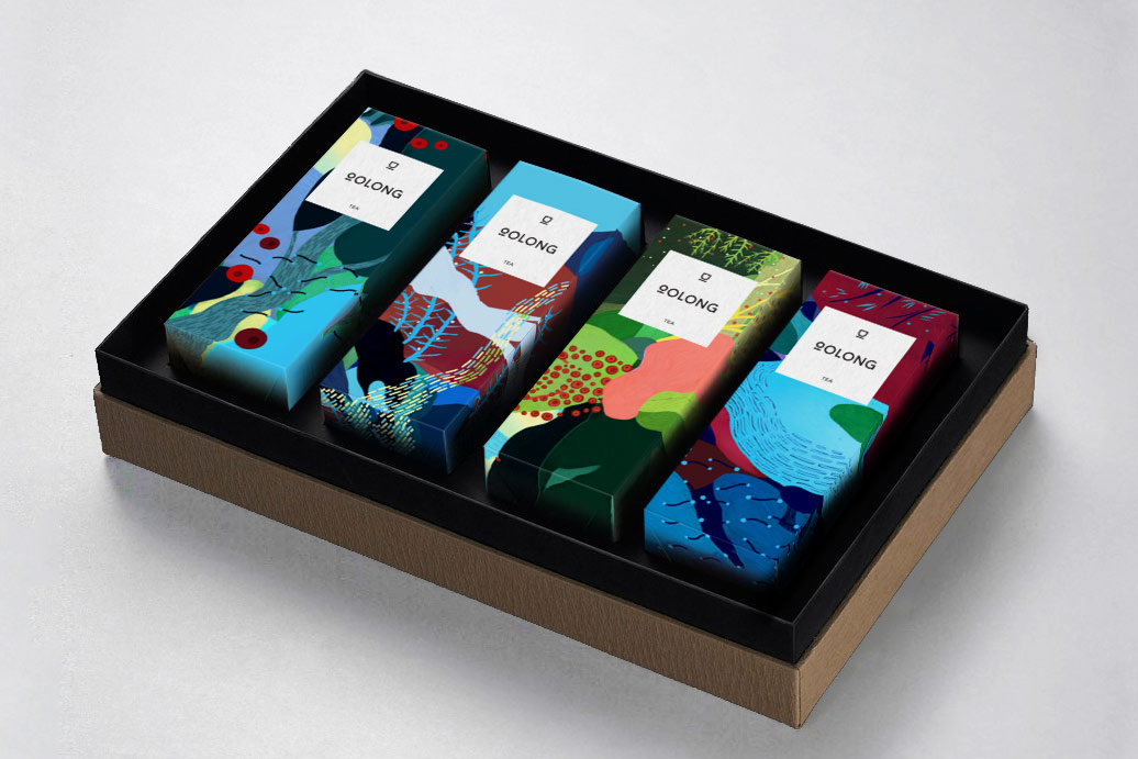
[vc_row content_text_aligment="" use_row_as_full_screen_section="no"][vc_column][vc_column_text] Oolong Tea [/vc_column_text][/vc_column][/vc_row][vc_row content_text_aligment="" use_row_as_full_screen_section="no"][vc_column][vc_column_text]The brief for this project was to create a full range identity for the Oolong Tea brand and its various types of tea. The client wanted to change the look of his whole product range and give his brand a

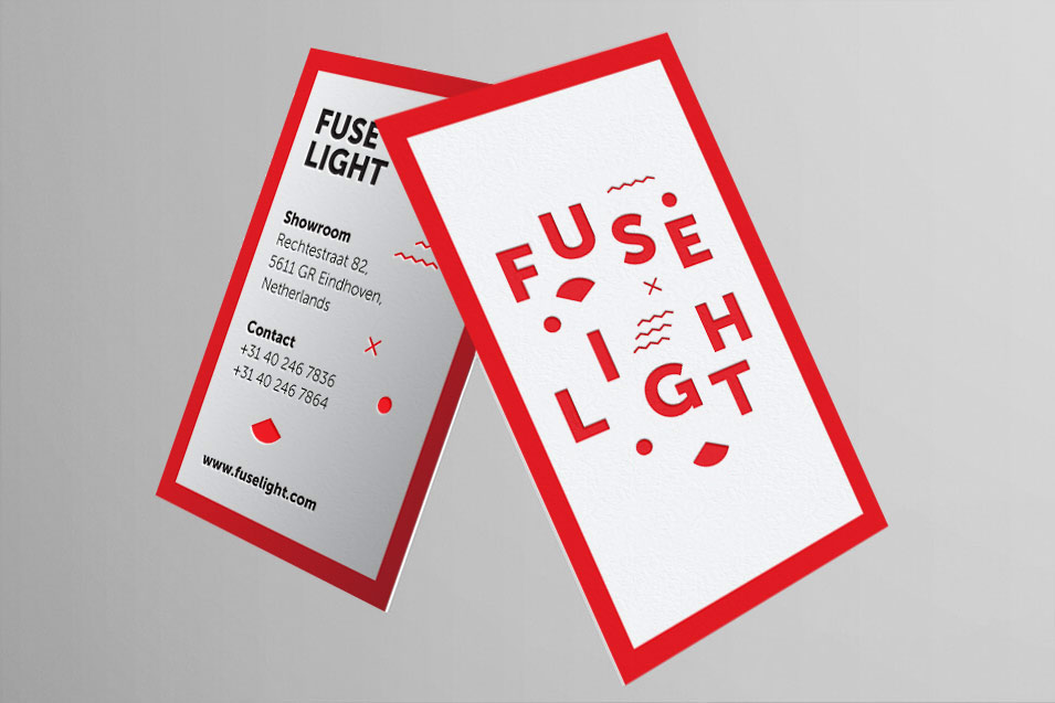
[vc_row content_text_aligment="" use_row_as_full_screen_section="no"][vc_column][vc_column_text] Fuse light [/vc_column_text][/vc_column][/vc_row][vc_row content_text_aligment="" use_row_as_full_screen_section="no"][vc_column][vc_column_text]These business cards were created for the Fuse Light lighting store. The client wanted a memorable look that would fit with his playful and creative branding. I went with a modern, carefully crafted design that has a lot going on,

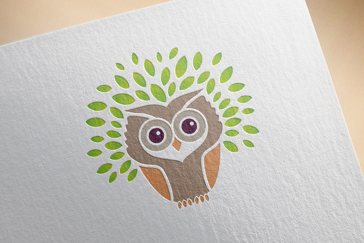
[vc_row content_text_aligment="" use_row_as_full_screen_section="no"][vc_column][vc_column_text] Owl logo design [/vc_column_text][/vc_column][/vc_row][vc_row content_text_aligment="" use_row_as_full_screen_section="no"][vc_column][vc_column_text]This logo was created for the ecological society “Sova” from Novi Pazar. This modern startup wanted a unique and friendly logo that would depict the nature of their organization and make their organization instantly memorable. The word “sova” means

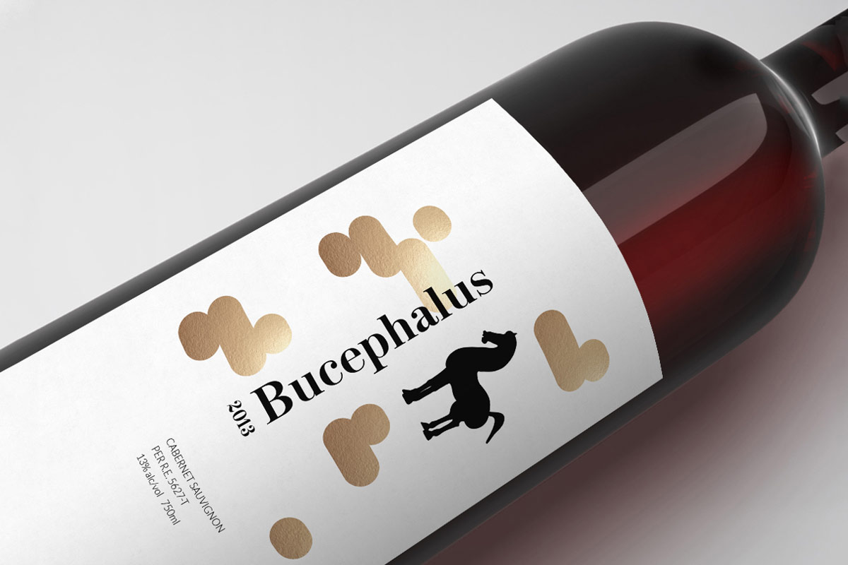
[vc_row content_text_aligment="" use_row_as_full_screen_section="no"][vc_column][vc_column_text] Bucephalus [/vc_column_text][/vc_column][/vc_row][vc_row content_text_aligment="" use_row_as_full_screen_section="no"][vc_column][vc_column_text]The client required special labels for the packaging of his premium wine bottles. So, I choose a simple visual language with a single dominant graphic element in order to clearly convey the high quality of the products. The overall result is

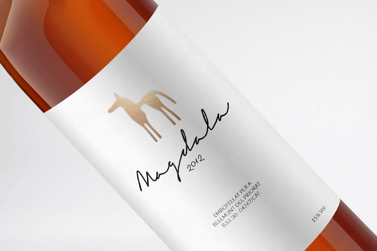
[vc_row content_text_aligment="" use_row_as_full_screen_section="no"][vc_column][vc_column_text] Magdala Wine [/vc_column_text][/vc_column][/vc_row][vc_row content_text_aligment="" use_row_as_full_screen_section="no"][vc_column][vc_column_text]I created both the logo and label design for the Spanish Magdala wines. The client wanted the label to have a feel that’s as special as the wines themselves, so I employed a minimalistic design to help the wines stand

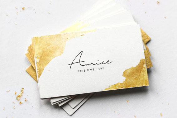
[vc_row content_text_aligment="" use_row_as_full_screen_section="no"][vc_column][vc_column_text] Amice [/vc_column_text][/vc_column][/vc_row][vc_row content_text_aligment="" use_row_as_full_screen_section="no"][vc_column][vc_column_text]I came up with this mock project to play around with a technique I consider immensely interesting. Using gold paper sheets and gluing them to the edges of the business card, I created a distinct look that remains simple yet sophisticated.

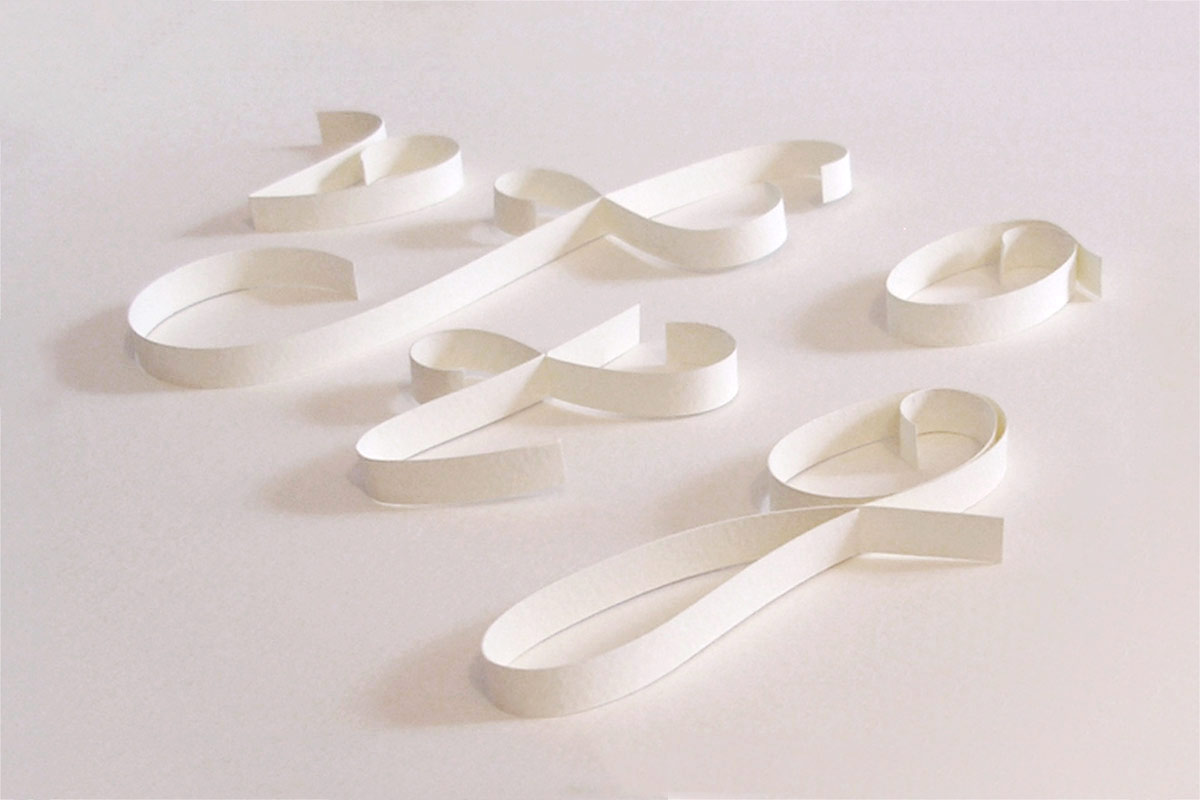
[vc_row content_text_aligment="" use_row_as_full_screen_section="no"][vc_column][vc_column_text] Paper font [/vc_column_text][/vc_column][/vc_row][vc_row content_text_aligment="" use_row_as_full_screen_section="no"][vc_column][vc_column_text]This is one of my favorite projects. I created over 120 typography characters out of paper. The font includes full alphabets (both Latin and Cyrillic), numbers, accent characters, as well as punctuation marks. This aesthetically pleasing font has a clean

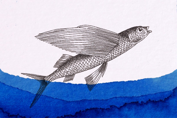
[vc_row content_text_aligment="" use_row_as_full_screen_section="no"][vc_column][vc_column_text] Flying Fish Restaurant [/vc_column_text][/vc_column][/vc_row][vc_row content_text_aligment="" use_row_as_full_screen_section="no"][vc_column][vc_column_text]The Flying Fish restaurant has built its reputation on a combination of high-quality food and family traditions. For the restaurants business cards and overall identity, the client wanted something really special. I combined simple and clear typography with a